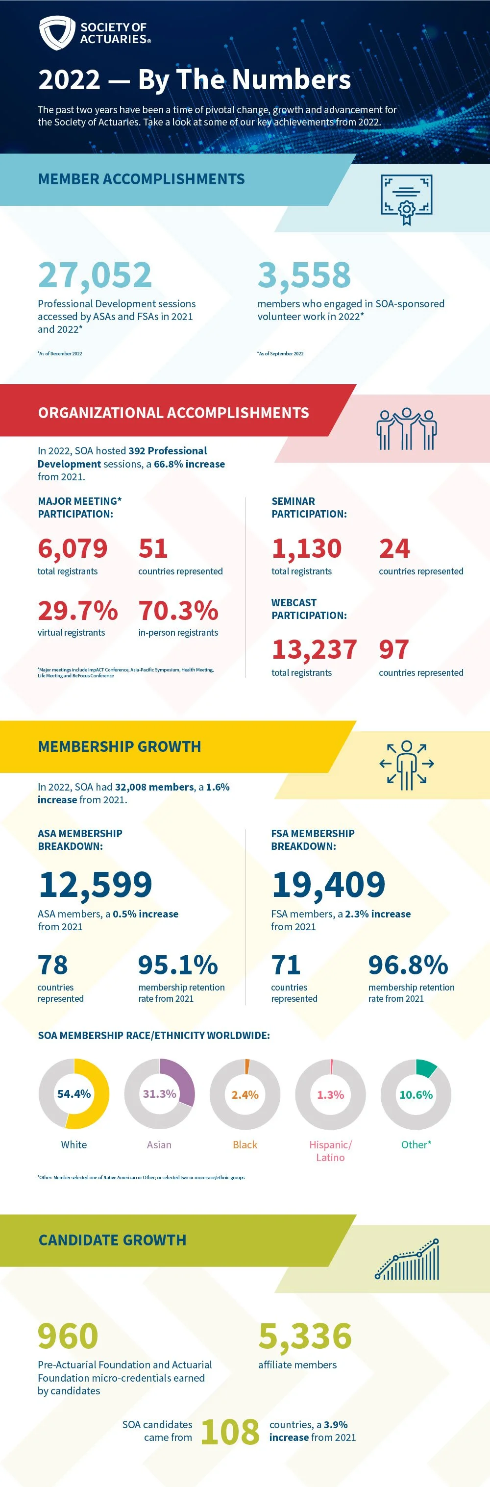
DATA VISUALIZATION & INFOGRAPHICS
Client: Society of Actuaries | Year: 2022
I designed this comprehensive infographic to synthesize a full year of data for the Society of Actuaries, translating complex metrics into a cohesive and accessible visual story. Through intentional use of color, typography, and iconography, I established a strong visual hierarchy that organized diverse data categories into a unified, engaging layout. The result was a polished piece that balanced analytical rigor with visual clarity, making detailed information approachable and compelling.
This infographic was created under the guidance of Art Directors and Account Leads at G&S Business Communications.